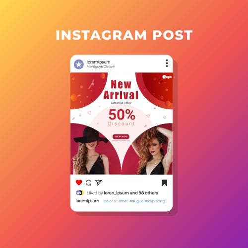
There are around 1.5 billion social media users across the world. Social selling is a modern approach to traditional sales, connecting brands with targeted prospects, and providing
value-adding resources to establish awareness and trust. Social Media Design is the most powerful tool in this digital world.
So here I share some design tips for making a great social media design.
I’m no expert, but I’ve learned a thing or two about creating social media design after lots of practice (and mistakes!), and I’m excited to share with you my favorite social media design tips and principles to help enhance your social media designs.
To create these, I rely on 07 simple design principles to help make the design
creation process easy. I’m very excited to share those with you in this post and how
you may be able to apply it to your own workflow.
1. Color
Color is one of the most important and complex aspects of any social media design. It helps to set the mood, create an atmosphere, convey emotions. Use colors in your social media images that guide your audience through a story.
The principles of color theory are a great place to start and can be used
to create a sense of harmony within your images.

2. Balance
The art of balance in the world of social media image design is a tricky one to get the hang of, but well worth the effort. A great way to think of balance is to imagine that each element of your design has a “weight behind it.”
It’s also important to remember that different elements carry different weights balance does not have to be split right down the middle.

3. Typography
Typography is an art. Selecting the perfect font or set of fonts that work seamlessly together can bring your social media image to life. It also has a big impact on how your design is received by people and, ultimately, the message your brand intentionally sends across. When selecting which font or fonts to use in your design one of the most important aspects to keep in mind is readability.
- Limit your design to a maximum of 3 typefaces
- Traditionally, serif fonts are best for print and sans-serif for web
- Kerning is a great technique to use in your titles

4. Contrast
Add contrast with colors, shapes, and sizes.
The use of effective contrast is a great way to enhance your social media images. Without contrast, your design runs the risk of being “flat.” But with too much contrast, your design can become cluttered and nothing will stand out. One of the easiest ways to implement contrast into your image designs is through the use of colors. For example, playing light colors off of dark colors.
Another way to easily add contrast to your image is through the use of shapes.

5. Proximity
Proximity is paramount when creating a sense of organization within your design. Similar or related elements are best grouped together to create a relationship between them. You can put the principle of proximity to action by connecting similar elements together. One easy way is by physical placement of the objects near each other. The other way is to connect them in other visual ways with the use of similar colors, fonts, size, etc.

6. Hierarchy
It’s quite likely that you’ll be working with multiple elements in your social media design And chances are each of those elements will be important to your overall message. Hierarchy is a great social media design tip to make sure that you’re getting your most important message across first.
Taking full advantage of the hierarchy design principle starts with an understanding of your goals. Establish the most crucial message as the focal point and then use the other design principles in this article to make it stand out.

7. Space
Put simply, negative space or white space is the area that surrounds other objects in the image.Space can help bring a certain aesthetic quality to your image while also highlighting the most important elements. Keep your images simple and use the space around objects to bring attention to important elements.

