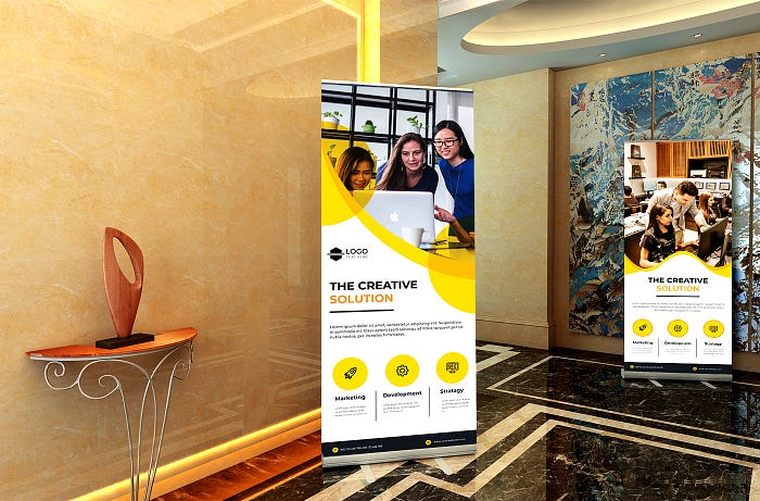
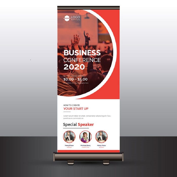
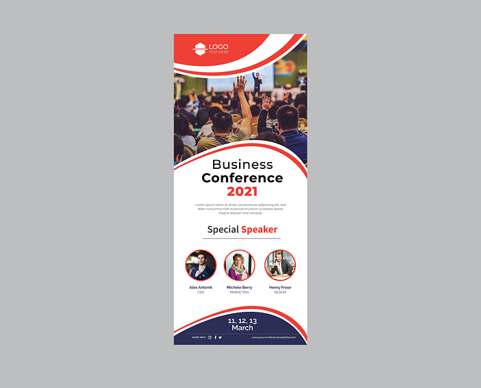
Roll Up Banner Stands, also known as Roller Banners or Pull Up Banners, are an important resource for any exhibitor looking to stand out at an exhibition or trade show. They can also be used to make a big impact in your shop or place of business as a great addition to your point of sale material.
What is a Roll-Up Banner?
Roll-up banners are widely used for advertising and informational purposes, for example on exhibitions and trade shows. The main purpose is to educate the customers regarding the product/service in the best possible manner. It’s a hattrick marketing tool that never goes out of style.
A Roll Up Banner can really help your product or service stand out at your next exhibition but it is important that you get the design basics right. My guide to designing for print will give you more information on what to consider when designing your Roll Up Banner.

Today I will show you How To design a great Informative Roll Up Design.
1. Keep your logo at the top:
Use the top of your roll-up banner to display your company’s logo and any pertinent information. Why? Often, it’s the first place that new viewers will look. Follow this down with your main message at eye level. It’s most likely to grab someone’s attention as they walk past it

2. Make your roll-up banner stand out with colors:
Let color be your friend when designing your roll-up stand. Colors can help to make you stand out at an exhibition but they must tie in and work well with your existing corporate colors and of course your logo. It is also important to consider the impact of the background color of your roll-up stand in relation to text and images. All images and text must be clear and easy to read on your stand. Bright colors like red and orange can really grab the attention but be sure to avoid using yellow and white together as it will be really hard to make out any information, especially from distance.

3. Make use of text and spacing:
Typography is the arrangement of letters and type in a way that’s both readable and artistically appealing. Consider not only the type you’re going to use on your banner but also the type that you’ve already used, especially in your logo. How you design and use the various typefaces available to you is one of the more important things when it comes to visual and graphic design. Typography can make or break a whole project, and it’s a field that comes with its own set of errors that beginners might not be aware of.

4. Order information in a ‘logical’ way:
When we for instance check important notes in our notebooks, we are used to reading from left to right and from top to bottom. People scan and read banners in the exact same way. The difference is that the time spent on reading a banner is much less, so keep words to a minimum by only focusing on truly relevant information.

5. Use high-quality pictures:
If you are going to include any images on your roll-up stand, particularly product images, then be sure that they are high quality. They should be at the very least 300 dpi and saved as CMYK ready for print. Remember you are trying to capture people's attention and draw them toward your products. If you want to choose a high-quality image check out the free stock photo on
6. Contact details:
One final thing to remember when designing your roll up banner stand is your contact details. This is particularly important for an exhibition where you may not get to talk to everyone in attendance. Contact details will give visitors information on how to best contact you should they want to avail of your services or find out more about a product. Include your website, contact number, and email address.

